Sorting
QTableSorting edits an ordered v-model:sorting list. It owns only the user interaction; the consuming application turns the emitted { id, desc } entries into an API query or table sort.
Inputs and state
| Prop/model | Default | Description |
|---|---|---|
v-model:sorting | required | Ordered SortingState: { id: string, desc: boolean }[]. |
fields | required | Available { value, label, disabled? } fields. |
icon | i-tabler-arrows-sort | Trigger icon. |
shortcuts | true | Enables Shift + S. |
texts | — | Explicit text overrides, ahead of i18n and English defaults. |
ui.content | — | Extra classes for the Nuxt UI popover content. |
Disabled fields and fields already in sorting are not offered by the default add selector. The trigger changes to the primary color when at least one sort is active.
Popover actions
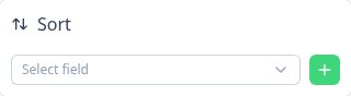
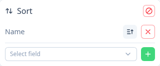
- Add sort — select one of the remaining fields and press the plus button. The component appends it with
desc: false. - Change direction — press the direction button on an existing entry to toggle its
descvalue. - Remove sort — press the remove button on an entry.
- Clear sorting — press the header action to emit an empty list.
- Use a custom order editor — the
itemsslot receivesmove(from, to)for an application-defined order UI.
vue
<QTableSorting v-model:sorting="sorting" :fields="sortableFields" />Slots
| Slot | Useful slot props |
|---|---|
trigger | open, toggle, active |
header | sorting, clear |
items | sorting, remove, toggleDirection, move |
item | sort, index, remove, toggleDirection |
add | availableFields, add |
Use a slot when the default region needs to be replaced, not merely renamed. Use texts for labels and accessible names.