Column options
QTableOptions manages the column-order, visibility, and pinning models without requiring a particular table adapter. The application applies the emitted models to its own table.
Inputs and state
| Prop/model | Default | Description |
|---|---|---|
columns | required | ColumnDefinition[], including column IDs, labels, and optional constraints. |
v-model:column-order | required | Ordered IDs displayed by the control. |
v-model:invisible-columns | required | IDs currently hidden. |
v-model:column-pinning | required | { left?: string[], right?: string[] }. |
icon | i-tabler-adjustments | Trigger icon. |
shortcuts | true | Enables Shift + O. |
texts | — | Explicit text overrides, ahead of i18n and English defaults. |
ui.content | — | Extra classes for the Nuxt UI popover content. |
Only IDs present in column-order are shown. A column with enableHiding: false keeps a disabled visibility switch.
Popover actions
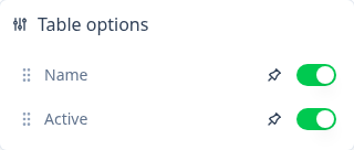
- Reorder columns — drag a row onto another row. The component emits a reordered
column-orderarray. - Show or hide a column — toggle the switch. The component adds or removes its ID from
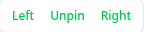
invisible-columnsunless hiding is disabled. - Pin left or right — open the pin action and choose Left or Right. The ID is removed from the other side first, then added to the selected side.
- Unpin — choose Unpin to remove the ID from both pinning arrays.
vue
<QTableOptions
  v-model:column-order="columnOrder"
  v-model:invisible-columns="invisibleColumns"
  v-model:column-pinning="columnPinning"
  :columns="columns"
/>
Slots
| Slot | Useful slot props |
|---|---|
trigger | open, toggle |
header | columns |
items | columns, move, toggleVisibility, pin |
item | column, index, visible, pin, toggleVisibility |
The slots let an application replace the whole list or a row while retaining the component's immutable state updates.