Filtering
QTableFiltering edits a Query Kit-compatible Filtering value. It owns the editor state and emits immutable replacements; the application serializes the result for its API.
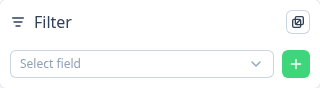
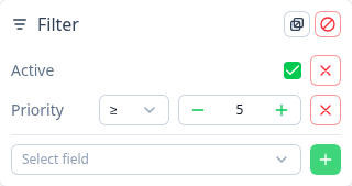
Inputs and state
| Prop/model | Default | Description |
|---|---|---|
v-model:filtering | required | FilteringMode.Intersect (AND) or FilteringMode.Union (OR) plus filters. |
fields | required | FilterField[] definitions for the available editors. |
icon | i-tabler-filter | Trigger icon. |
shortcuts | true | Enables Shift + F. |
texts | — | Explicit text overrides, ahead of i18n and English defaults. |
ui.content | — | Extra classes for the Nuxt UI popover content. |
The trigger changes to the primary color when filters are active. Disabled fields are excluded from the add selector.
Popover actions
- Change filter mode — the header button switches between
ANDandORwhile retaining every filter. - Clear filters — the header action resets the value to an empty
ANDfilter group. - Add filter — choose an enabled field and press the plus button. The initial operator and value are derived from its type.
- Edit a boolean — the default checkbox writes
trueorfalse. - Edit a number — choose
=,≠,>,≥,<, or≤, then enter a number. - Edit enum and select fields — choose
∈or∉and select multiple values. Enum fields may provide a custom component; select fields require one. - Remove filter — press the remove button next to an entry.
vue
<QTableFiltering v-model:filtering="filtering" :fields="filterFields" />Slots
| Slot | Useful slot props |
|---|---|
trigger | open, toggle, active |
header | filtering, clear, toggleMode |
items | filters, remove, update |
item | filter, field, remove, update |
add | fields, add |
Use the item slot for an entirely custom per-field editor; use a field's component when only its value input differs.